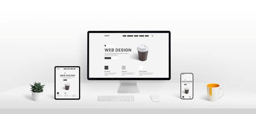
Implementing effective responsive web design best practices is no longer optional for modern businesses—it is the foundation of digital success. With over 60% of all global web traffic originating from mobile devices, search engines like Google exclusively use mobile-first indexing to determine search rankings. If your business site fails to provide a seamless mobile experience, your brand is actively losing search visibility and customer conversions.
In this developer guide, we explore 7 proven strategies for applying responsive web design best practices to deliver fast, beautiful, and accessible user experiences across every screen size.
1. Adopt a True Mobile-First Design Mindset
Mobile-first design means architecting your user interface for small screens first, then progressively enhancing the layout for desktop viewports.
Starting with limited screen real estate forces you to prioritize essential content and streamline navigation. When you implement responsive web design best practices, starting small prevents unnecessary layout clutter and reduces heavy CSS overrides later in your stylesheet.
2. Implement Fluid Grid Layouts with Modern CSS
Fixed pixel dimensions break screen adaptability. Modern CSS layouts should rely on relative units such as percentages (%), viewport units (vw, vh), rem, and CSS Grid/Flexbox architectures.
- CSS Flexbox: Best for one-dimensional layouts (e.g., navigation bars, form rows).
- CSS Grid: Ideal for two-dimensional grid structures like portfolio galleries and pricing tables.
Using fluid grids ensures your web components scale dynamically based on screen width without triggering horizontal scrollbars.
3. Establish Touch-Friendly Navigation & Click Targets
Mobile users interact with their screens using thumbs, not precise mouse cursors. Small buttons placed closely together lead to accidental clicks and user frustration.
Following official user experience standards, interactive elements should be at least 48×48 pixels with adequate spacing around them. For deep technical specifications on accessibility and touch targets, review the official W3C Accessibility Guidelines.
4. Optimize Responsive Typography for Legibility
Text that looks crisp on a desktop monitor can become unreadable on a mobile screen if font sizing, line height, and character limits aren’t adjusted properly.
- Base Font Size: Keep body text at a minimum of
16px(1rem) on mobile screens. - Line Height: Set line spacing between
1.5and1.6for optimal readability. - Line Length: Aim for 45 to 75 characters per line to prevent reader eye fatigue.
5. Serve Adaptive and Next-Gen Image Formats
Large desktop images drain mobile data plans and slow down page performance. Responsive web design requires adaptive image loading using the HTML <picture> element and srcset attributes.
By providing multiple image resolutions, browsers automatically select and render the smallest suitable file size for the user’s device screen. Additionally, convert all graphics to modern image formats like WebP or AVIF to cut file sizes by up to 30% without loss of visual quality.
6. Conduct Multi-Device and Cross-Browser Testing
Never rely solely on desktop browser resize tools during development. Real-world mobile testing requires inspecting your site across real devices and operating systems.
Verify your site performance on Android devices, iPhones, tablets, and low-spec phones. You can test your site’s mobile compatibility using Google Search Central Mobile Inspection Tools.
7. Eliminate Performance-Busting Mobile Bloat
Mobile processors are significantly less powerful than desktop computers. Heavy background animations, unoptimized JavaScript bundles, and intrusive popups slow down rendering speed and create negative user experiences.
Focus on lightweight CSS transitions, lazy loading for below-the-fold media, and clean JavaScript execution to keep your mobile site responsive and fast.
Build a Seamless Mobile Experience Today
Mastering responsive web design best practices gives your website a strong foundation for search rankings, user retention, and customer growth.
If you need a responsive, high-converting website engineered for your brand, check out our freelance web development portfolio to view recent mobile-first projects or explore our complete list of custom website design services.